The making of a Nature cover
Table of contents
- Our guiding principles for cover artwork
- Benefits of submitting cover artwork
- How artwork is selected
- Types of cover artwork
- What we seek, and things to avoid
- Things to avoid
- How to submit
Our guiding principles for cover artwork
Nature-branded journals use a specific set of guidelines and principles in the selection and creation of cover artwork. This guide is for authors submitting artwork for consideration for the cover of the journal Nature and the Nature-branded family of research journals. We encourage you to get creative and submit artwork to accompany your manuscript — and if you follow this guide, you might just end up on the cover!
Benefits of submitting cover artwork
Why should I submit cover artwork? Cover artwork plays a unique role in communicating your research. Striking artwork sparks interest and curiosity in your work, and often engages a wider audience than other scientific visuals such as figures in a research paper, which are powerful but tend to communicate more narrowly.
Hopefully your submission lands on the cover, but regardless, your efforts in creating an accessible, beautiful representation of your research will not be wasted. These types of image are extremely useful for communicating your research in other ways, such as in press releases, posters, presentations, websites and social media, where new audiences are ready and waiting.
How artwork is selected
How do we choose? The selection process varies by journal, but generally speaking, once papers are assigned an issue, a shortlist of cover submissions is made for that issue, and those papers compete against each other for the cover.
There is no one path to a cover — once on the shortlist, artwork can be selected because of the topic of the research or the superior quality of the artwork. In any case, the best way to increase your chances is to follow this guide, submit your best work and make the shortlist.
For Nature the flagship journal only: As a weekly multidisciplinary journal, Nature aims to feature a variety of scientific disciplines from week to week. In addition, the cover story should be freshly published, so there should not be a gap of more than a few weeks from the date of online publication to when it appears in print. Papers taking our accelerated publishing route (AAP) are generally not eligible for the cover for this reason, so if you prioritize a chance at a cover over publication speed, please mention this to your manuscript editor.
Types of cover artwork
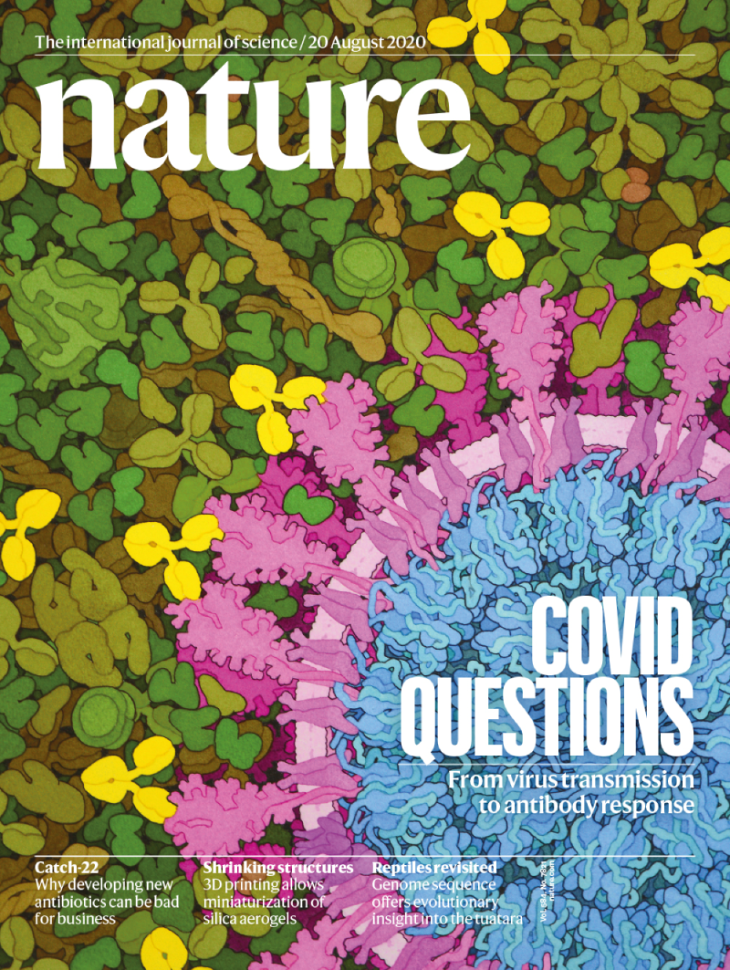
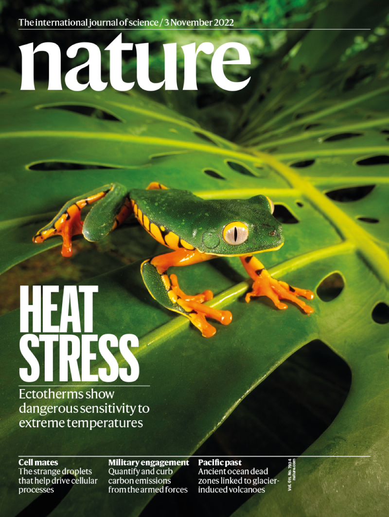
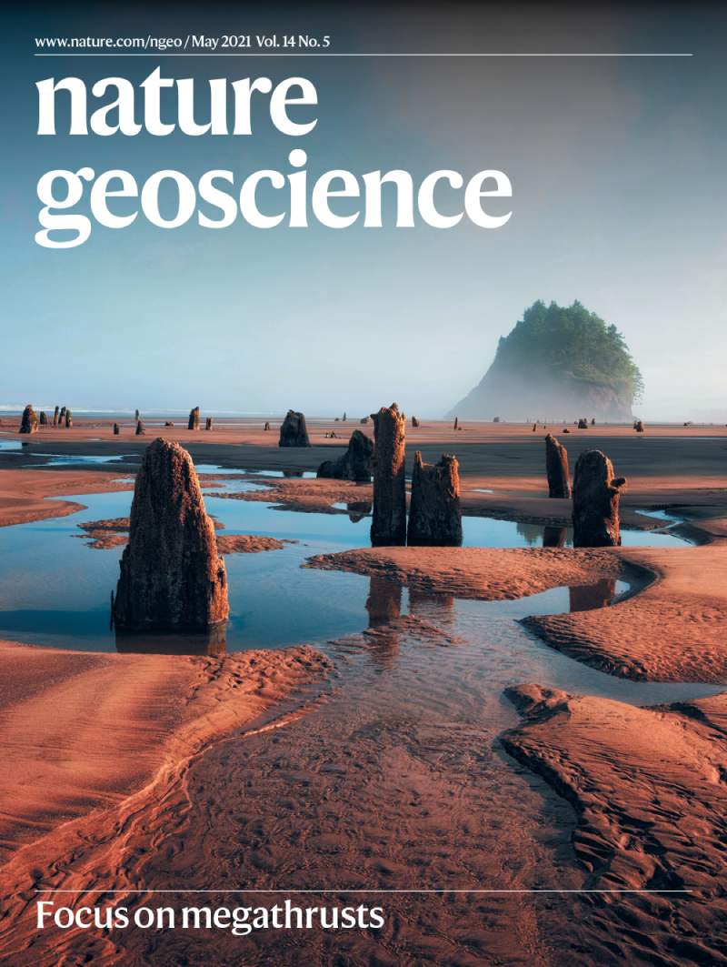
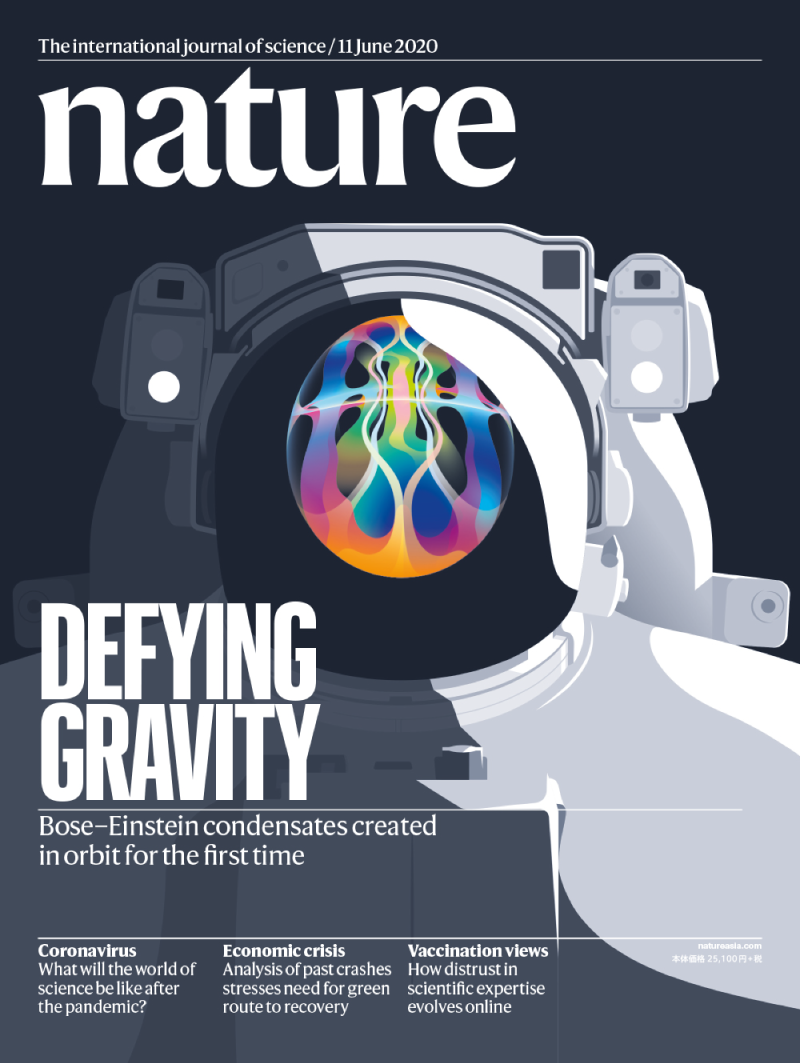
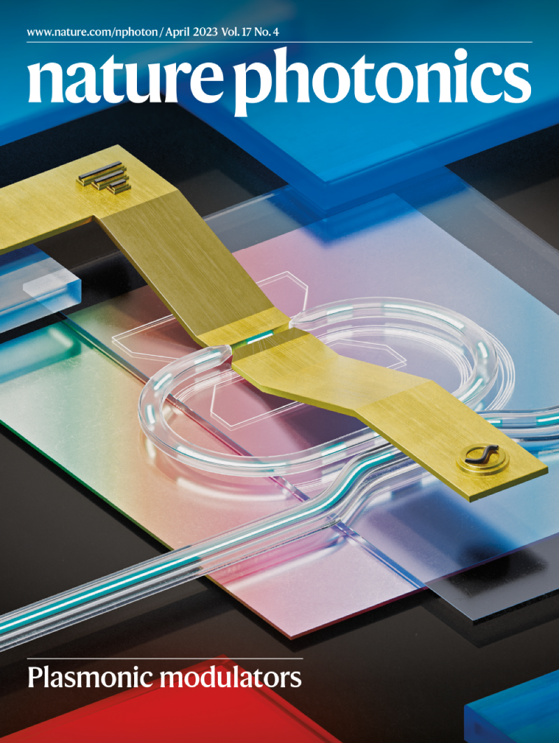
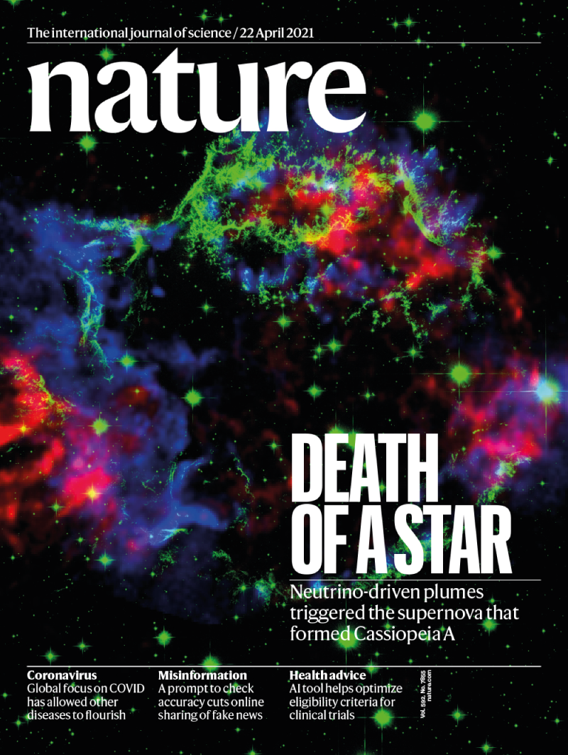
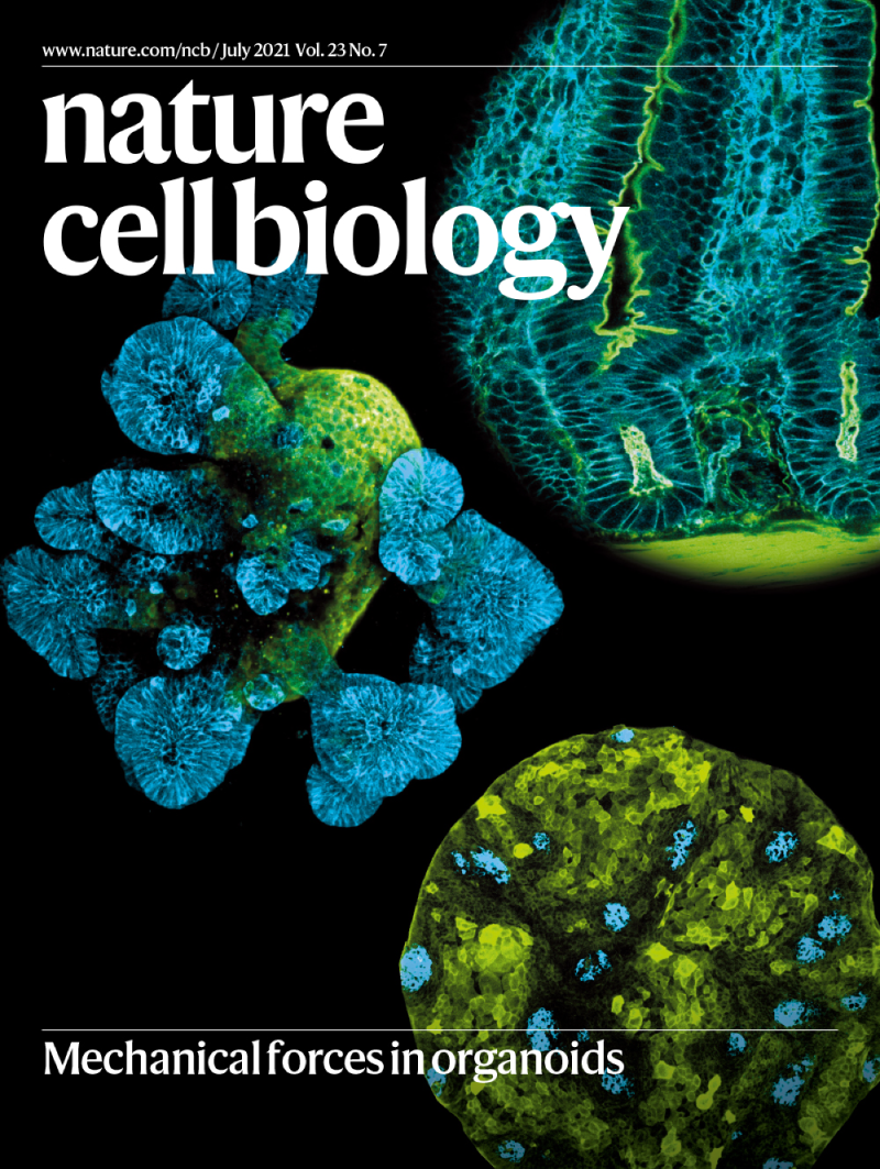
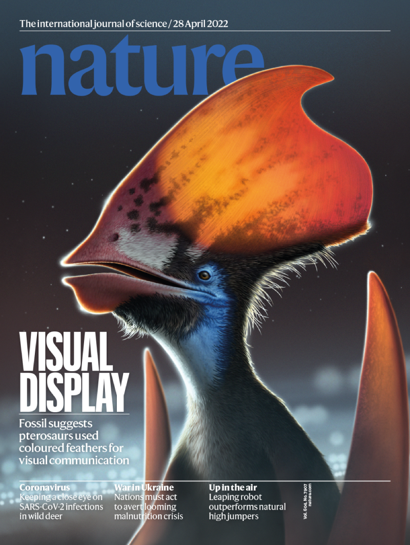
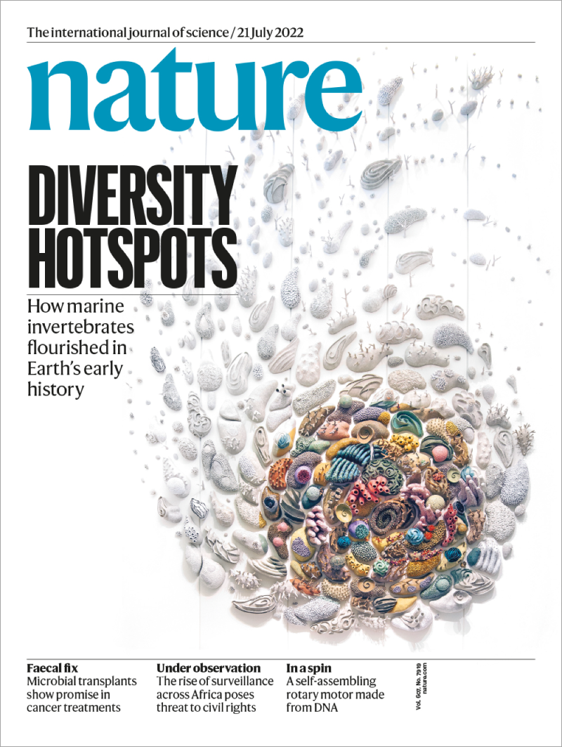
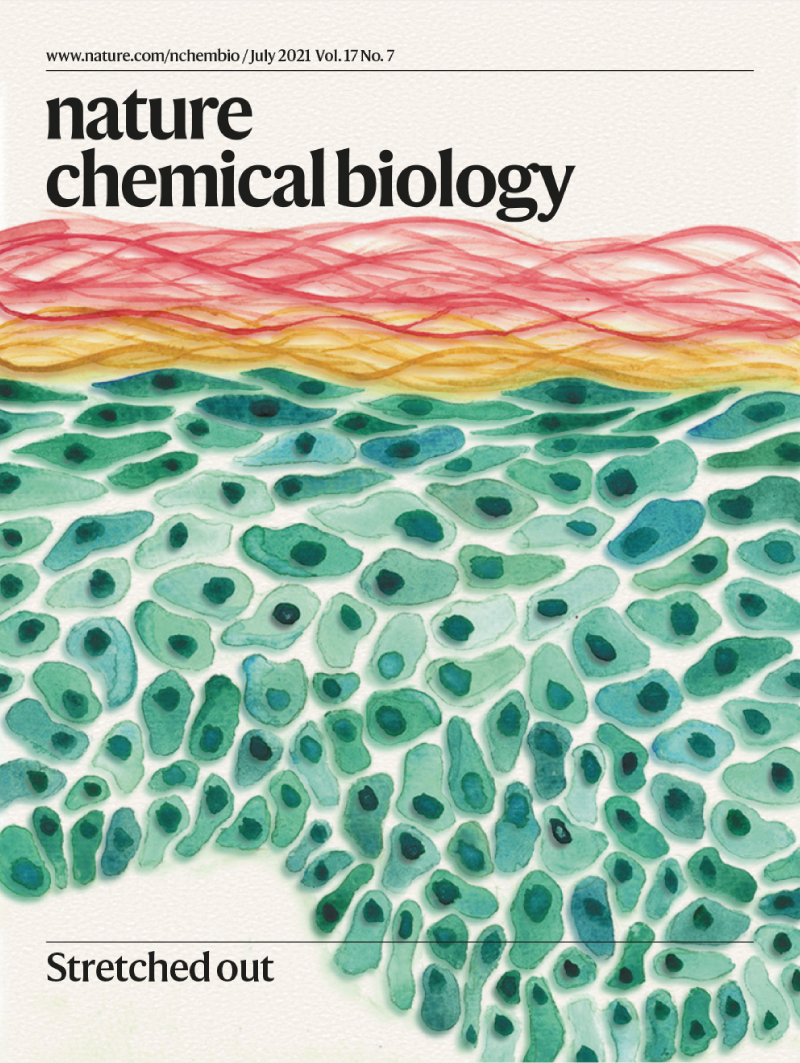
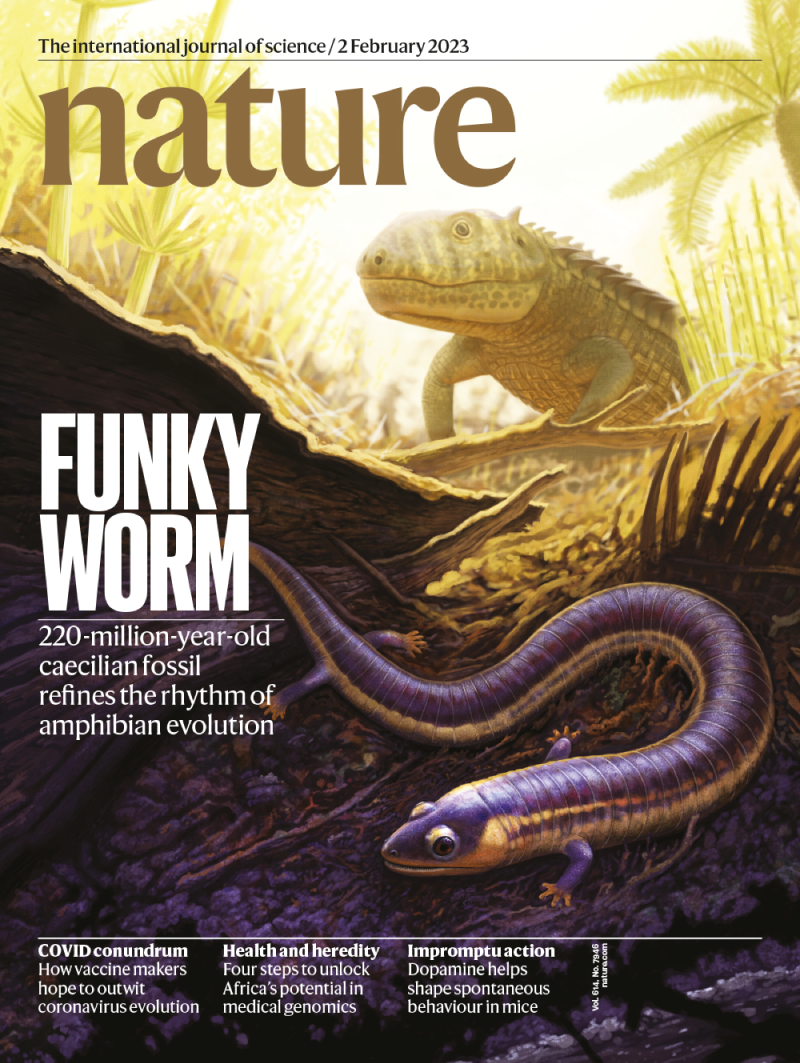
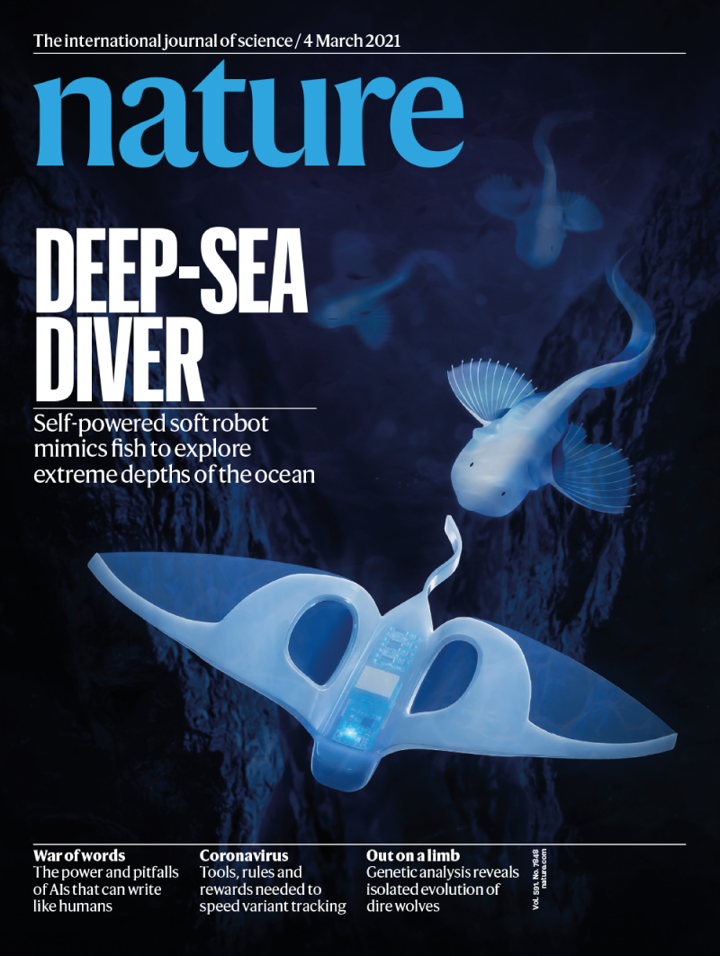
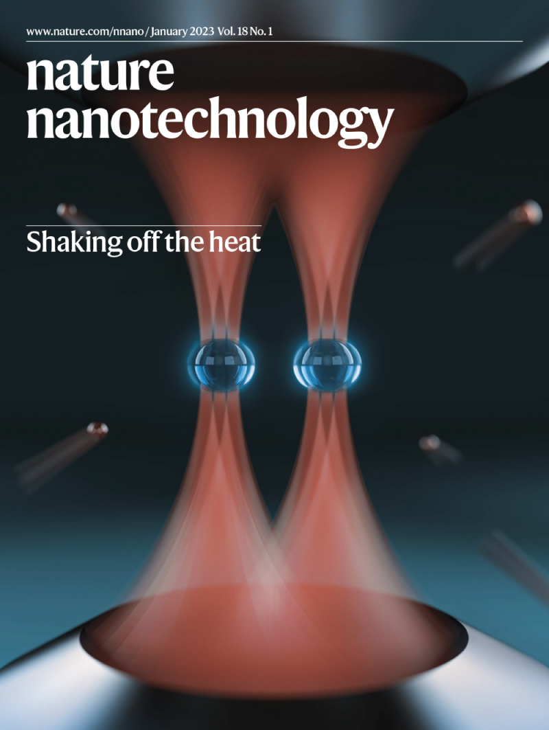
There is no ‘best’ artistic medium for covers. Quality artwork can come from anywhere, from classic techniques such as painting and drawing to electronic forms such as 3D rendering, microscopy and digital photography.
Common types of journal cover artwork:
- Photography
- Illustration (2D and 3D)
- Imaging
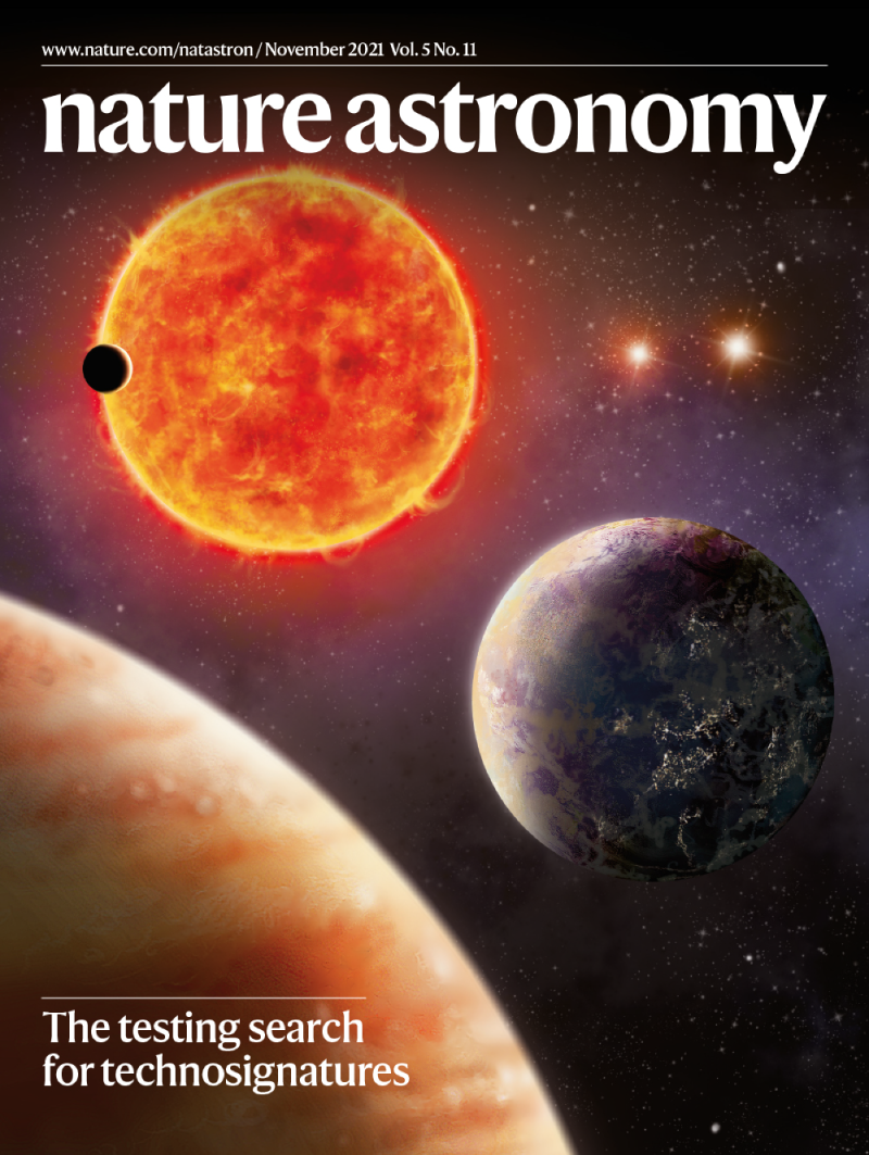
- Computer modelling
- Artist conception
What we seek, and things to avoid
What we look for in a cover. The best journal covers are a perfect blend of art and science. They tell a story that represents the research accurately, beautifully and creatively, without misleading elements.
Covers are not like figures in your paper — they do not bear the burden of telling the entire story of your research. Rather, they tempt the viewer to learn more. They can be very specific or abstract, as long as they have some of the following qualities.
We seek artwork with:
- Beauty (composition, proportion, balance)
- Technical quality (resolution, clarity)
- Simplicity
- Novelty
- Action
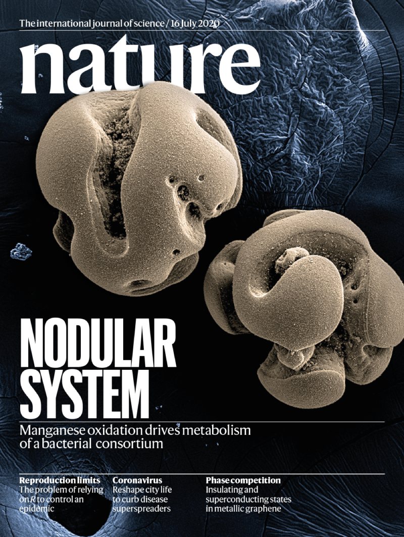
Resolution and clarity are absolutely essential, and must be addressed at the very first stages of creating imagery. From digital photography to microscopy, please make your originals as high resolution as possible. 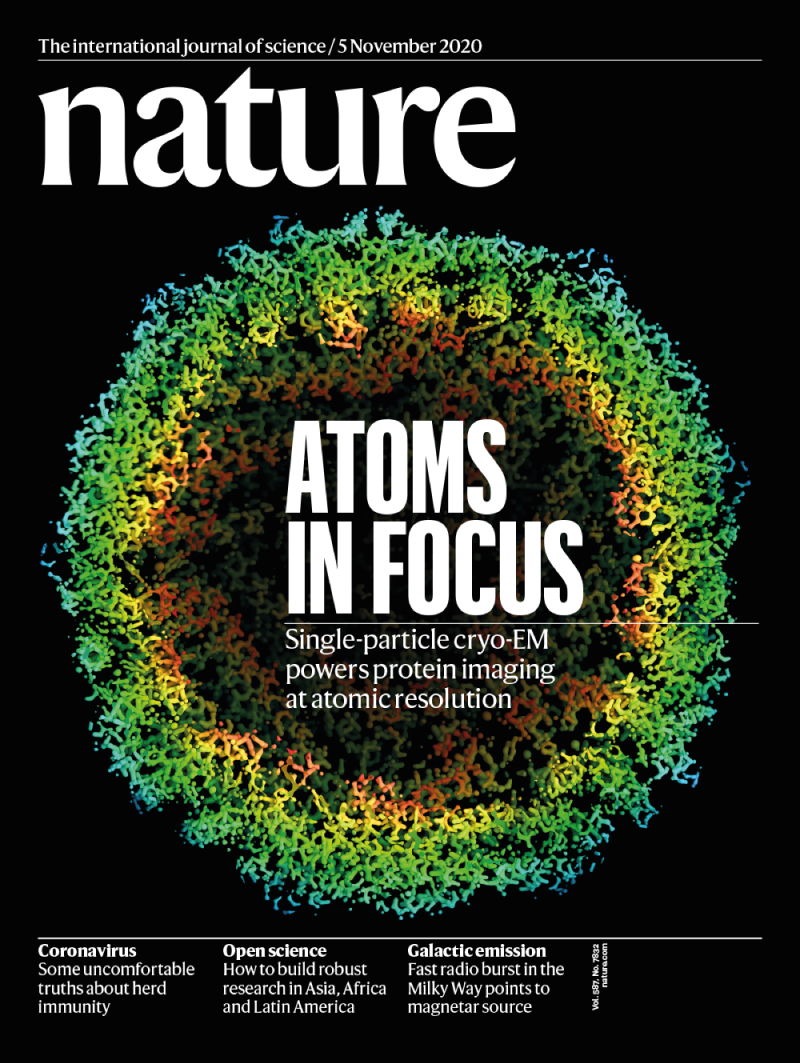
Novelty, seeing something that has never been seen before, or in a totally new way, makes cover artwork particularly memorable.
Things to avoid
Not all publishers of scientific journals share the same styles and standards. What might work for some journals may not be appropriate for the overall style and tone of the Nature-branded group. Here are some of the most common things we see that might disqualify a submission.
Some common mistakes:
- Too crowded and cluttered; no thought for composition
- Low resolution at full size, blurry or pixelated
- Too childish or cartoonish
- Overused clichés, such as question marks or puzzle pieces
- Copyright infringement, such as depicting a character from film or television
- Images created by Generative AI (such as from DALL-E, Stable Diffusion, and Midjourney) are not permitted
How to submit
Please submit your cover artwork through the manuscript tracking system when you upload the final version of the manuscript files. If you are not ready to submit cover artwork at this stage, please follow up with the editor who handled your manuscript and they can provide further instructions. To ensure there is enough time to consider your cover artwork, however, it should be sent to us as soon as possible after the submission of your final manuscript files, ideally within 2 weeks.
Cover specifications
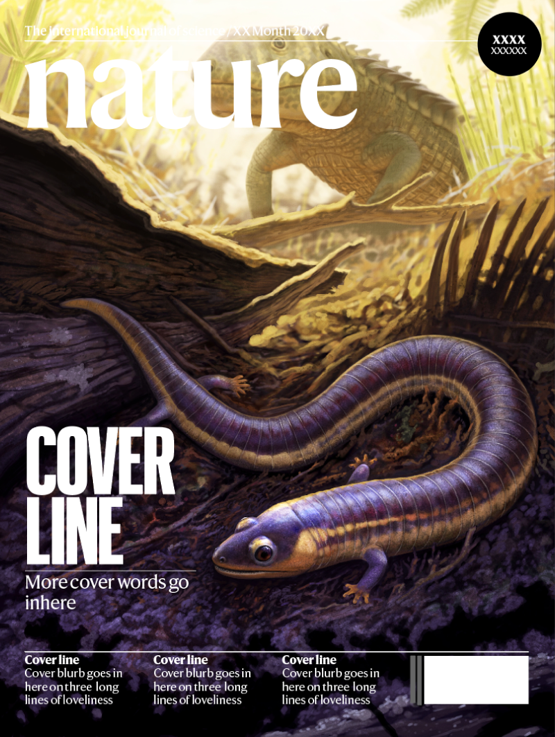
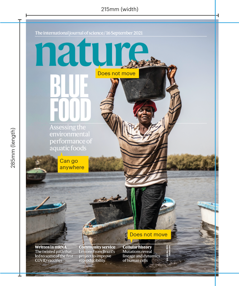
Our covers are 213mm x 285mm. This includes a 3mm bleed on the top, bottom and right.
Files should be at least 300 dpi at actual size, in .psd, .tiff, ,jpeg or .png formats. Lower resolution can be submitted through the system initially, but please add a note that higher resolution is available.
Please leave space in your composition for the standard ‘page furniture’, such as the journal logo at the top and the various coverlines. But please DO NOT include the logos themselves in your artwork.
Coverlines
Nature the flagship journal has one main cover line (paired with a smaller secondary line) that can go anywhere, along with three small teasers along the bottom that do not move.
All other Nature-branded research journals have a single coverline that can go anywhere.
On behalf of the art teams at Nature and our portfolio of Nature-branded journals, we thank you and look forward to receiving your beautiful cover artwork.
