Preparing figures - our specifications
Table of contents
Graphs
The clear presentation of data is imperative for the understanding of research. To ensure data are as easy to interpret as possible, we ask you to include (and avoid) certain features.
We also ask authors to consider accessibility across main and extended data figures. This includes considering colour use for the visually impaired. Wherever possible, the Nature.com site will adhere to level AA of the Web Content Accessibility Guidelines (WCAG 2.1)
We require
- Axis lines and tick marks to be included
- All axes to be labelled with units in parentheses, e.g. Data (unit)
- An accessible colour palette to be used (for example Wong, B. Points of view: Colour blindness. Nature Methods 8, 441 (2011).)
- Legible text (a minimum of 5 pt in size)
- Standard fonts (e.g. Arial or Helvetica) to be used
We avoid
- Background gridlines
- Superfluous icons and other decorative elements
- Drop shadows
- Patterns
- Text placed on top of busy images and hard-to-read backgrounds
- Overlapping text
- Coloured text; keylines, keys, etc. should be used instead
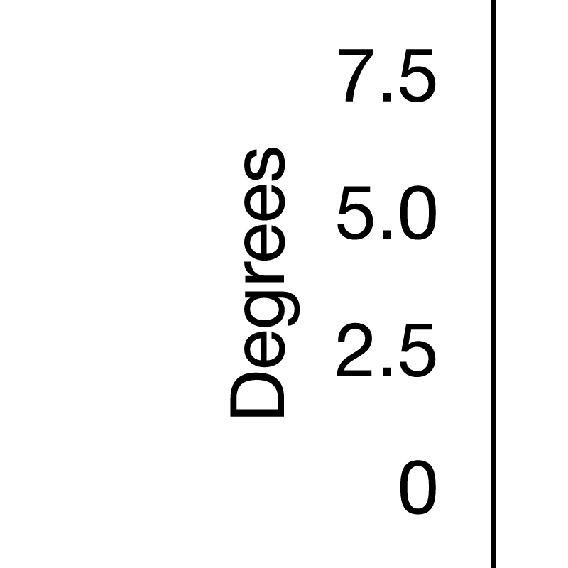
Avoid: Missing tick marks and insufficient axis labelling. 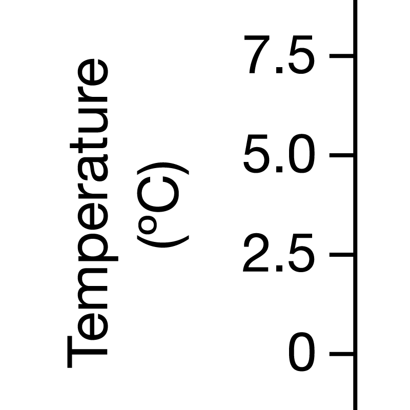
Recommended: Tick marks are added to the axis and units are listed on the axis label.


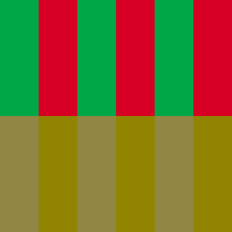
Avoid: Colour combinations which may be indistinguishable for readers with colour blindness. Here the red and green colours are very hard to tell apart when a filter to simulate the effects of colour blindness is applied. 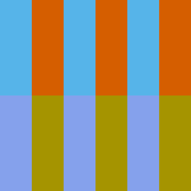
Recommended: Colour combinations which retain sufficient contrast when a filter is applied to simulate their appearance to a reader with colour blindness.


Avoid: Coloured text in figure legends. 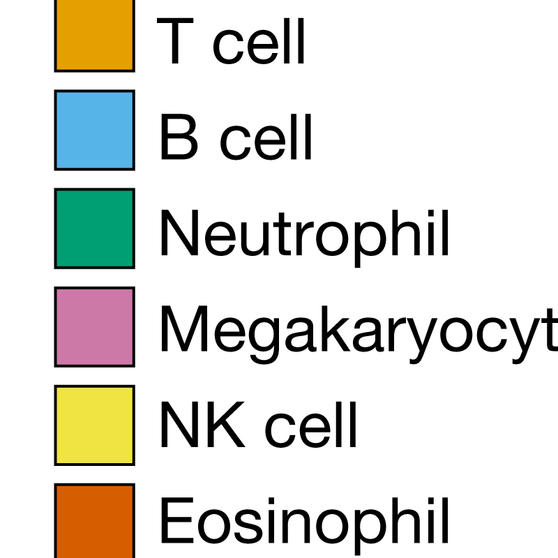
Recommended: Coloured boxes combined with black text to reference colour in figure legends.


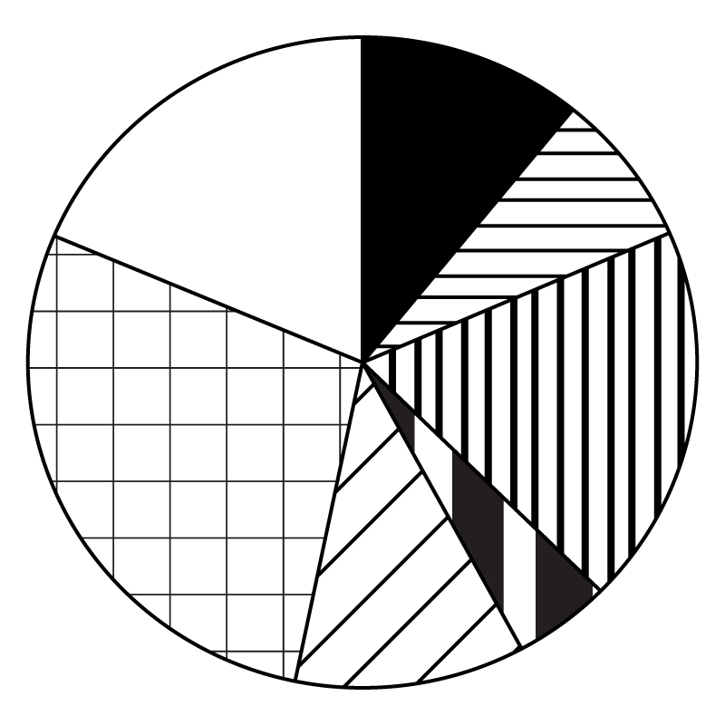
Avoid: Patterns used to differentiate sectors. 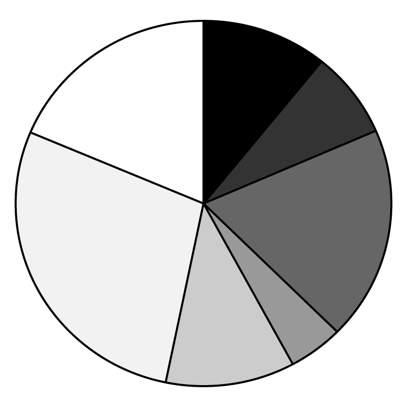
Recommended: Solid colours used to differentiate sectors.


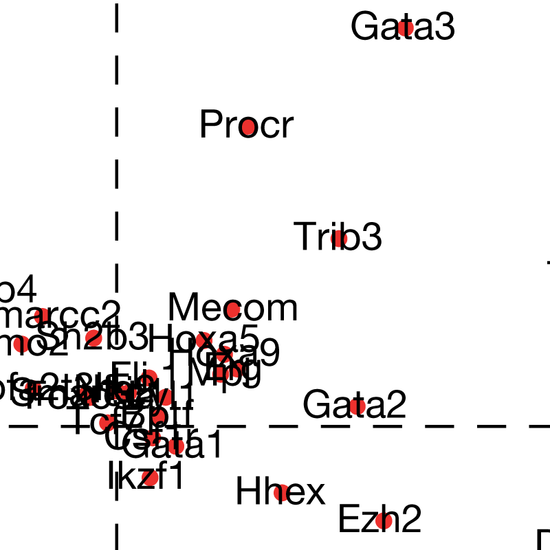
Avoid: Small, overlapping and hard-to-read text. 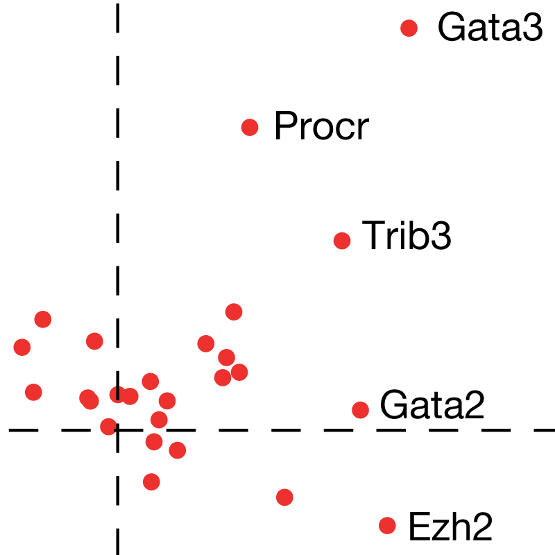
Recommended: Labels rearranged to not overlap with each other or the underlying data.


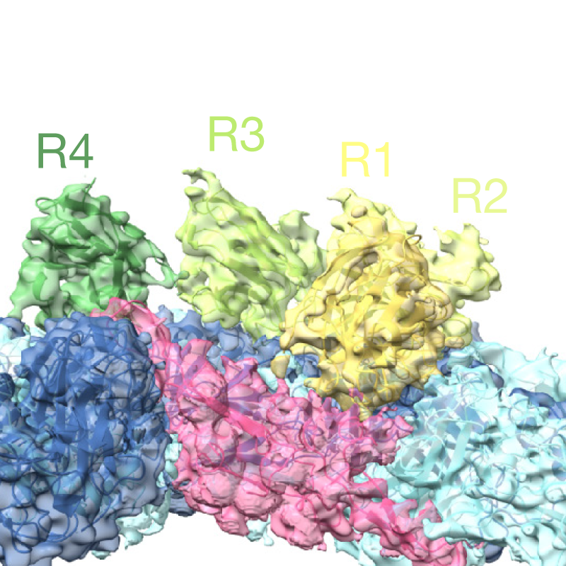
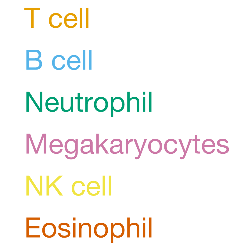
Avoid: Coloured text labels. 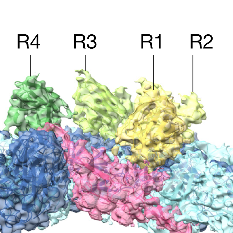
Recommended: Keylines pointing to black text labels.


Images
Colour space
We recommend supplying your artwork in the RGB colour spectrum. This provides a wider gamut than the CMYK print format and allows more faithful reproduction of fluorescent colours when viewed digitally.
Please note that while your online pdf will retain the RGB colour space, for print artwork will be automatically converted to CMYK.
Avoid: artwork supplied in the CMYK colour space. 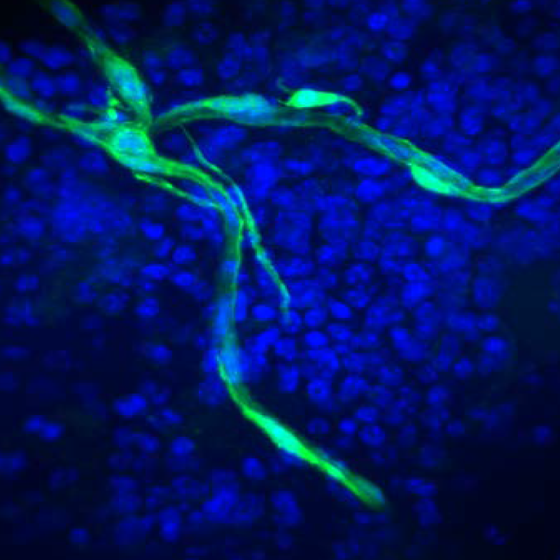
Recommended: artwork supplied in the RGB colour space.


Image resolution
All photographic images must be supplied at a minimum of 300 dpi. The maximum dpi of online proofs is 450 dpi; supplying images at 450 dpi or above ensures they will have the highest resolution possible.
Artificially increasing an image’s resolution in an artwork program will not improve its quality.
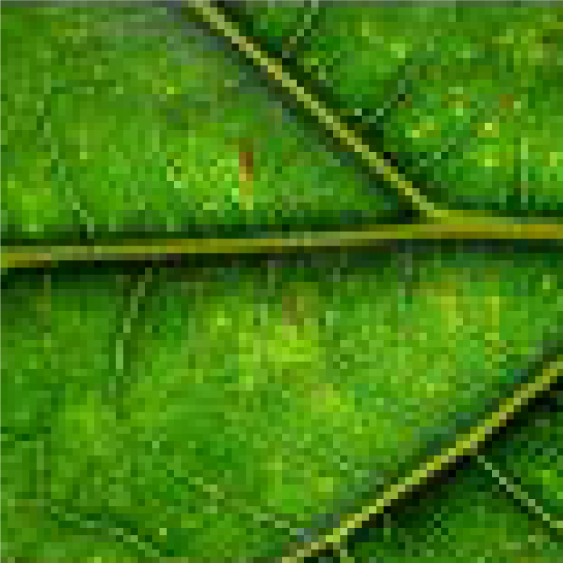
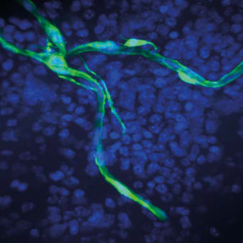
Avoid: low resolution images. These will appear pixelated and fuzzy when printed. 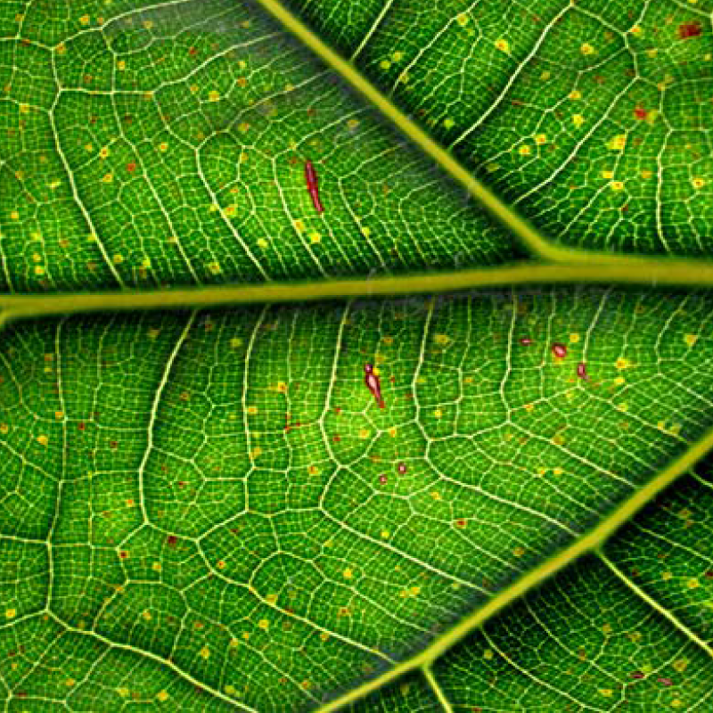
Recommended: high-resolution images supplied at 300 dpi or above.


Scale bars
For photographic images with scale bars, please do not flatten the scale into the image. Keep the scale bar and any text on a separate, editable layer.
Scale bars should be used rather than magnification factors.
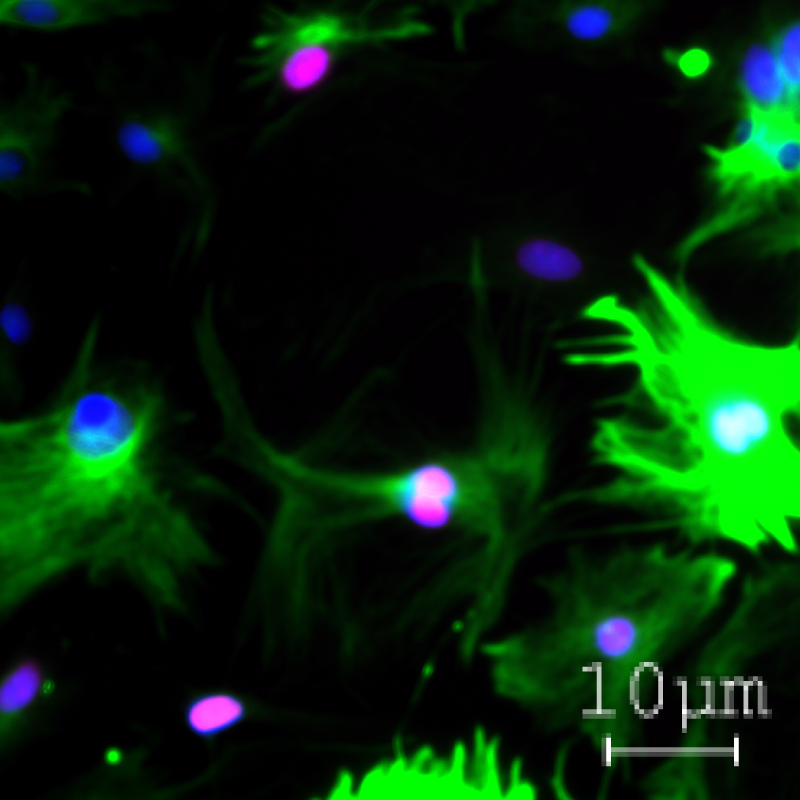
Avoid: scale bar and label flattened into the background image. These will appear pixelated and will not be sized correctly. 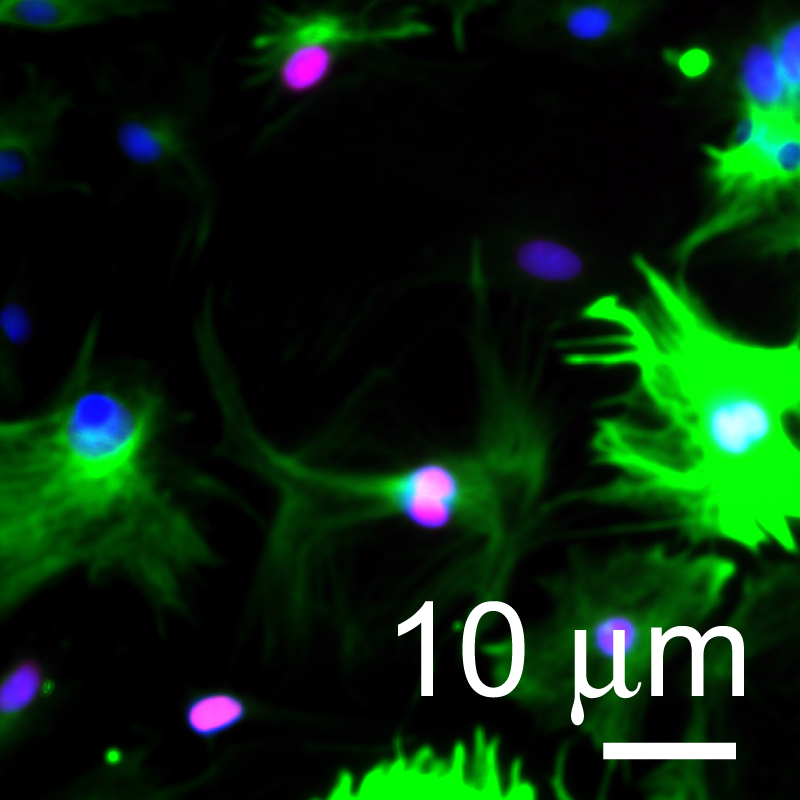
Recommended: scale bar and label on separate layer for best presentation.


Text
For figures to be accepted all text needs to be legible and editable.
- Use standard fonts (e.g., Arial or Helvetica)
- Choose to retain all editing capabilities
- Do not outline text
- Embed fonts (True Type 2 or 42)
- Avoid coloured text
- Maximum text size: 7 pt
- Minimum text size: 5 pt
- Present amino-acid sequences in Courier (or other monospaced) font using the one-letter code in lines of 50 or 100 characters
Font choices
All text should be a sans-serif typeface, preferably Helvetica or Arial.
Amino acid sequences should be presented in one-letter code in Courier font.
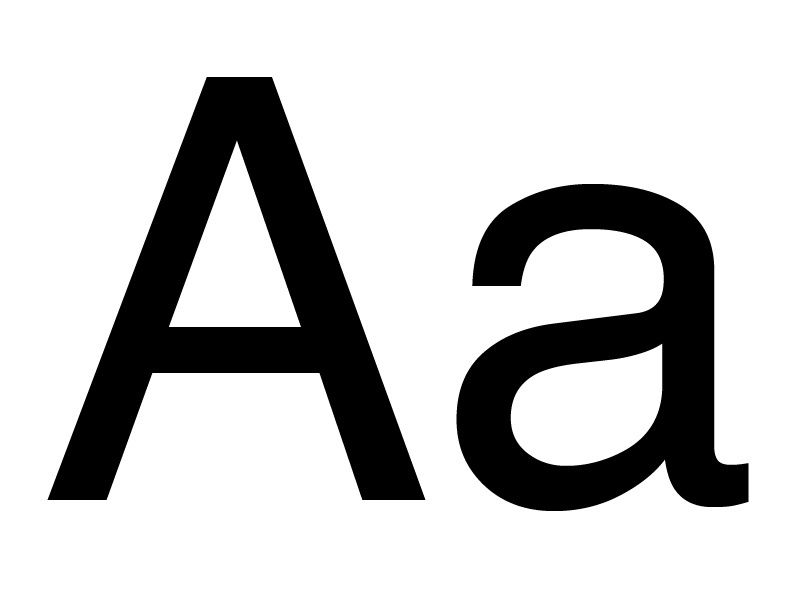
Separate panels in multi-panelled figures should be labelled with 8-pt bold, upright (not italic) and lowercase a, b, c, etc.
Maximum text size for all other text is 7-pt and the minimum is 5-pt.
Use Symbol font for glyphs and the Greek alphabet.
Sans-serif body text. 
Bold labels. 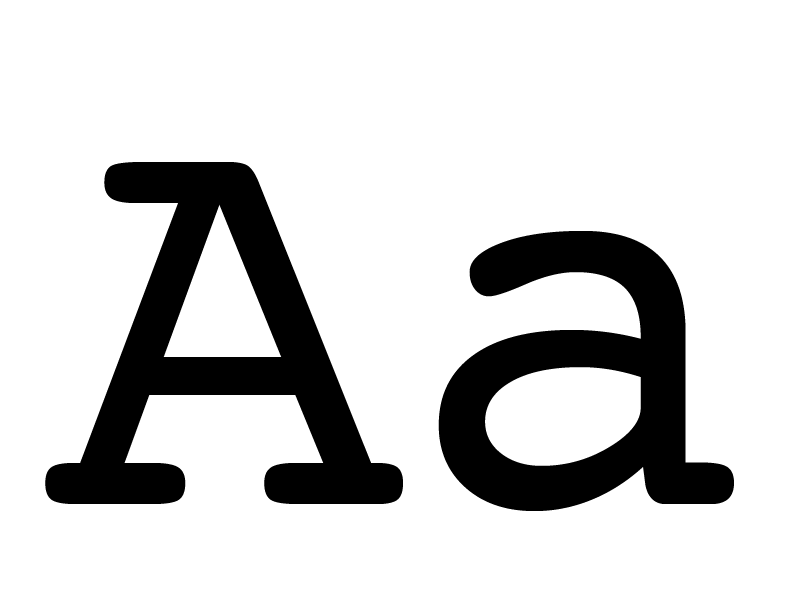
Courier one-letter code. 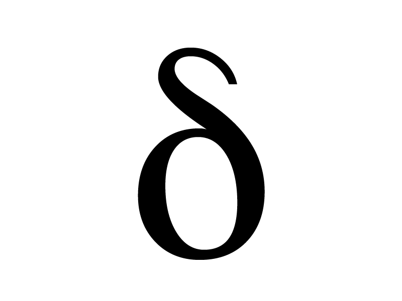
Symbol used for Greek characters.


Outlined text
Outlined text means that text is converted to shapes (or outlined) when opened in Adobe Illustrator, and the text has not been recognized by our computers. To resolve this:
- Use standard fonts (e.g., Arial or Helvetica)
- Choose to retain all editing capabilities
- Do not outline text
- Embed fonts (True Type 2 or 42, do not select TrueType 3)
- If you are using Python please use the following setting:
Matplotlib.rcParams['pdf.fonttype']=42 - If you are using Matlab on linux, this may cause the issue as it uses freetype, not truetype. You’ll need to export the figures from a mac or windows machine
- If you are using Prism, choose to uncheck the outline text option. If you use Prism on MAC, you will need to save to PDF, choosing to retain all editing capabilities

Avoid outlined text: Characters are vector shapes, and spelling and font style and size cannot be adjusted. 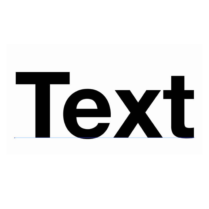
Non-outlined text required: The text is an editable text layer and can be adjusted.


Guide to chemical structures
Although there are a number of ways that chemical structures can be drawn based on individual preferences, our journals use consistent styling wherever possible. Please consult our style guide to chemical structures to avoid delays in publication.
Style guide for chemical structures.
Exporting
Having taken the above advice on board, please export figure panels as vector artwork — where lines, arrows, scale bars and text, etc. are all in an editable format. We need to be able to carry out edits to text, stroke widths, etc., to scale artwork as necessary and to ensure that the figures are presented in Nature house style.
- .pdf or .eps preferred
- All text, scale bars, boxes, etc. as vector artwork
- RGB colour space
- Use standard fonts (e.g., Arial or Helvetica)
- Do not outline text
- Embed fonts (True Type 2 or 42)
- For images, minimum 450 dpi