Building and exporting figure panels
Table of contents
- Figure sizing
- Panel arrangement
- Fonts
- Accessibility
- Main figure accepted formats
- Extended Data accepted formats
Figure sizing
The widths of printed figures are:
- 89 mm (single column)
- 183 mm (double column)
The maximum height for a Nature figure is 170 mm, to allow space for the figure legend to fit underneath.
In the production process, figures may be reduced to a smaller size due to space limitations. Authors are encouraged to submit figures at the smallest appropriate size, ensuring all fonts are between 5pt and 7pt. Nature reserves the right to make the final decision on figure size.
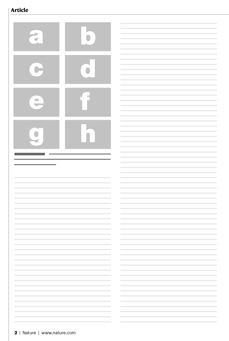
89 mm (single column) 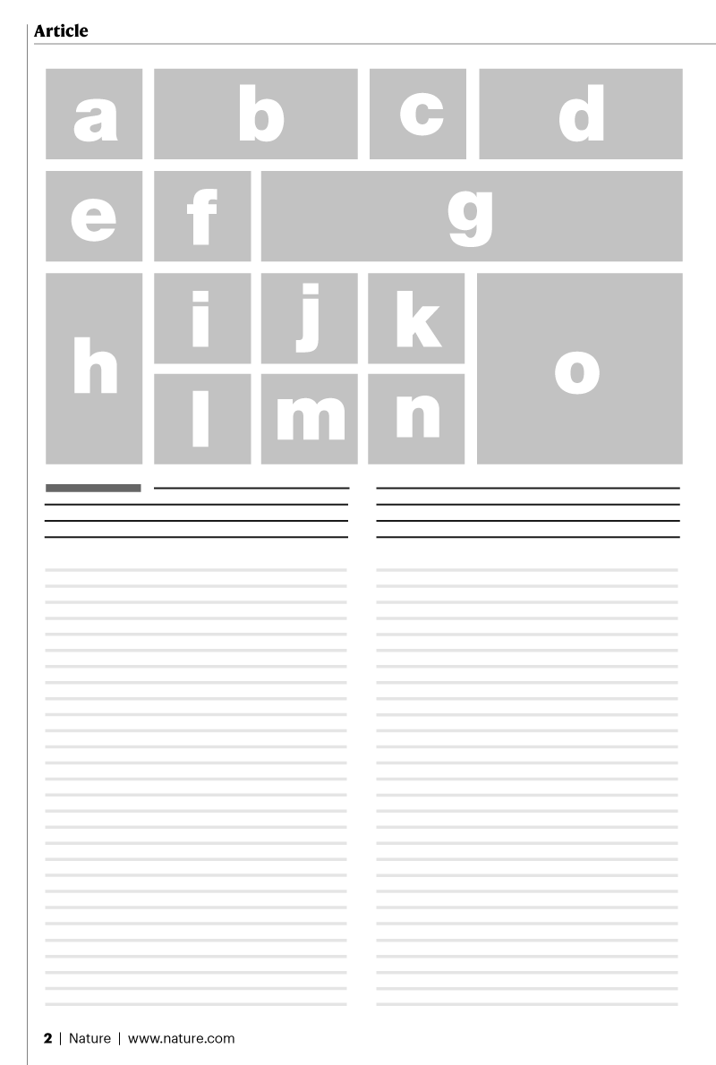
183 mm (double column)
Panel arrangement
Figures should be laid out in a neat and space-efficient manner, minimizing white space and with panels in an alphabetical order wherever possible. Consider the content and legibility of each panel and let that define its size within the figure. Some panels may require more space than others, whilst some panels don’t need to be unproportionally large.
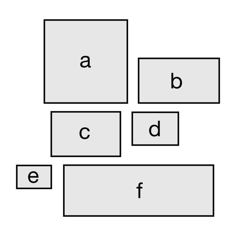
Avoid: poorly arranged figure panels not in alphabetical order. 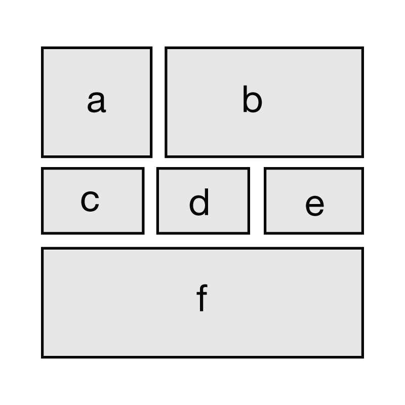
Recommended: neatly arranged figure panels make the best use of available space.
Fonts
For figures to be accepted all text needs to be legible and editable.
- Use standard fonts (e.g. Arial or Helvetica)
- Choose to retain all editing capabilities
- Do not outline text
- Embed fonts (True Type 2 or 42)
- Avoid coloured text
- Maximum text size: 7pt
- Minimum text size: 5pt
- Amino-acid sequences should be presented in Courier (or other monospaced) font using the one-letter code in lines of 50 or 100 characters.
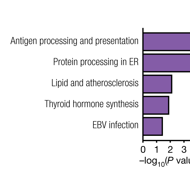
Avoid: non-standard fonts used for figure labels. 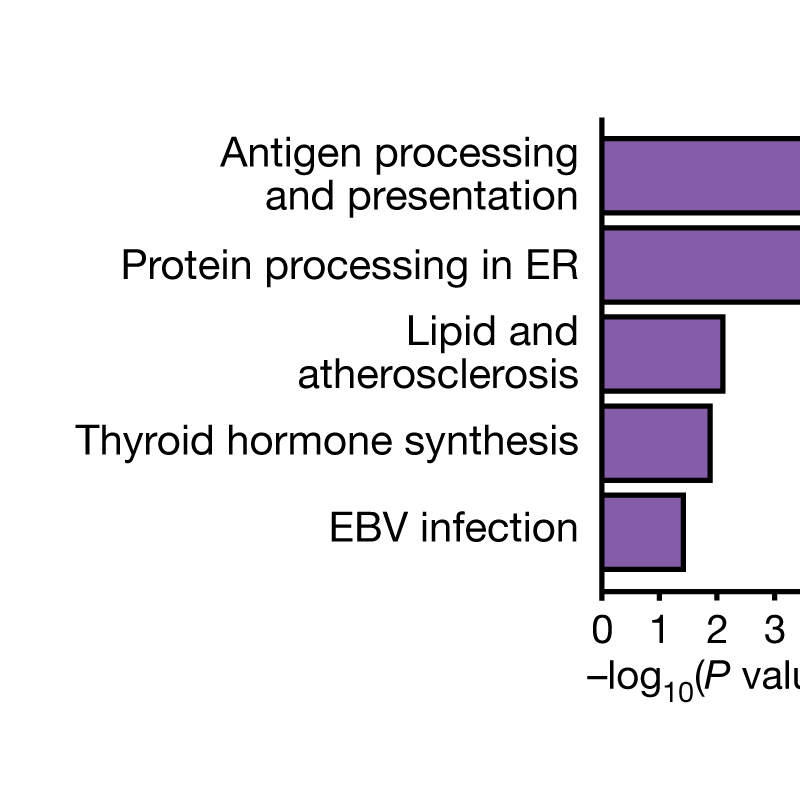
Recommended: standard fonts used throughout the figure labels.
Accessibility
Nature.com adheres to level AA of the Web Content Accessibility Guidelines (WCAG 2.1) wherever possible. To help make research accessible to all readers we ask authors to consider accessibility across main and extended data figures.
Making your colours accessible
Using accessible colour combinations, distinctive hues and high-contrast text ensures that figures are accessible to readers with low vision, colour blindness or visual disabilities. Avoiding red/green combinations and rainbow scales helps readers with colour blindness todistinguish datasets and interpret data correctly. Keys or keylines should be used in the figure wherever possible, rather than having colour descriptions in the figure caption, as readers with colour blindness can struggle to interpret these descriptions.
| Name | Values | Preview | ||||
|---|---|---|---|---|---|---|
| Hex | RGB | CMYK | Normal sight | Protanopic sight | Deuteranopic sight | |
| Black | #000000 | 0,0,0 | 0,0,0,100 | Black colour seen with normal sight. | Black colour seen with protanopic sight. | Black colour seen with deuteranopic sight. |
| Orange | #e69f00 | 230,159,0 | 0,50,100,0 | Orange colour seen with normal sight. | Orange colour seen with protanopic sight. | Orange colour seen with deuteranopic sight. |
| Sky blue | #56b4e9 | 86,180,233 | 80,0,0,0 | Sky blue colour seen with normal sight. | Sky blue colour seen with protanopic sight. | Sky blue colour seen with deuteranopic sight. |
| Bluish green | #009e73 | 0,158,115 | 97,0,75,0 | Bluish green colour seen with normal sight. | Bluish green colour seen with protanopic sight. | Bluish green colour seen with deuteranopic sight. |
| Yellow | #f0e442 | 240,228,66 | 10,5,90,0 | Yellow colour seen with normal sight. | Yellow colour seen with protanopic sight. | Yellow colour seen with deuteranopic sight. |
| Blue | #0072b2 | 0,114,178 | 100,50,0,0 | Blue colour seen with normal sight. | Blue colour seen with protanopic sight. | Blue colour seen with deuteranopic sight. |
| Vermillion | #d55e00 | 213,94,0 | 0,80,100,0 | Vermillion seen with normal sight. | Vermillion seen with protanopic sight. | Vermillion seen with deuteranopic sight. |
| Redish purple | #cc79a7 | 204,121,167 | 10,70,0,0 | Redish purple colour seen with normal sight. | Redish purple colour seen with protanopic sight. | Redish purple colour seen with deuteranopic sight. |
Avoid coloured text
High contrast text (>4.5 contrast ratio) should be used to make text easy to read for all. Black or white text on a high- contrast background should be used wherever possible — where colour is not necessary for clarity or scientific meaning, we will recolour text to black or white.
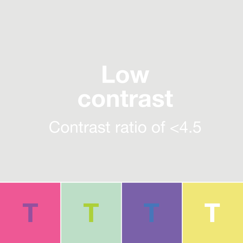
Avoid: text without sufficient contrast to the background colours. The text in this image is difficult to read. 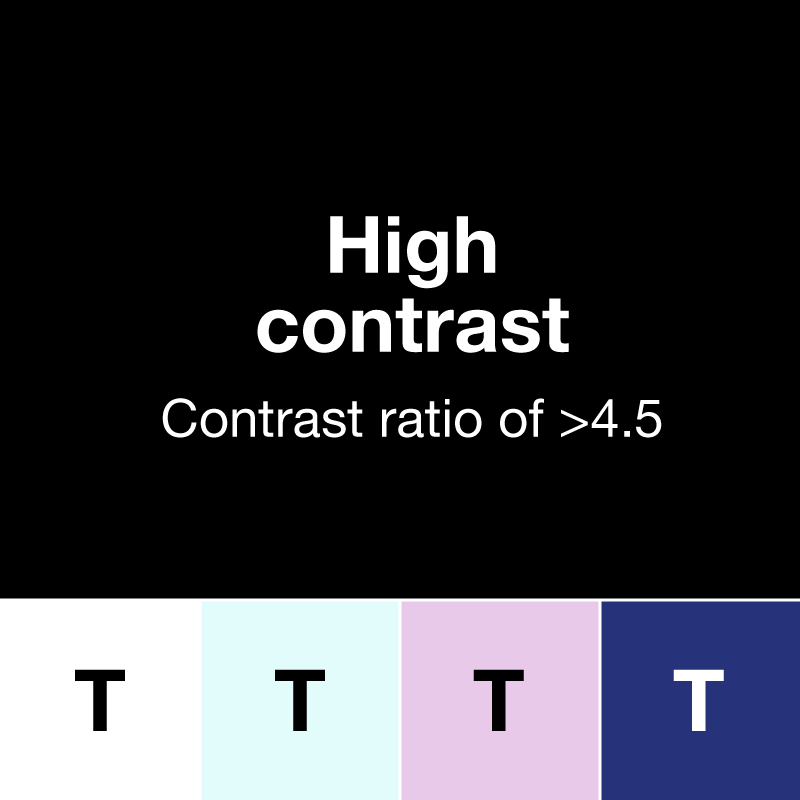
Recommended: text which has sufficient contrast with the background colours.
Avoid decorative icons
Text should be used instead of decorative icons wherever possible. Icons can be open to interpretation and confuse the meaning of figures. Simple text labels should be used, and our general rule is to remove superfluous icons from figures. There are some cases in which simple icons can aid clarity, as they help the reader to visualize the real-world situation. These are not counted as purely decorative as they are useful and add clarity by providing context.
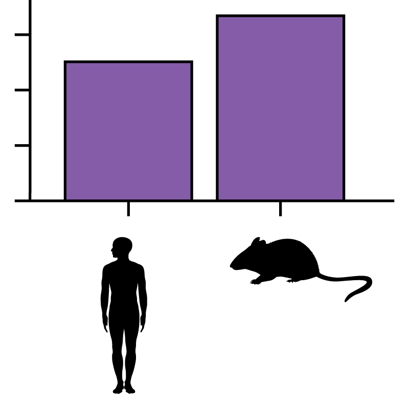
Avoid: decorative icons which can be misinterpreted; for example, mouse and rat icons can be easily confused. Similarly, does the icon above represent ‘male’ or ‘human’ or some other characteristic? 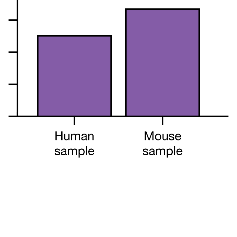
Recommended: text labels should be used throughout.
Main figure accepted formats
For main figures we require vector files with editable layersNature’s preferred formats are:
- .ai
- .eps
- .pdf (please choose to retain all editing capabilities)
Acceptable formats:
- Layered Photoshop files (please avoid applying effects to text as this will have to be removed so the file doesn’t lose all its layers when opening in Illustrator. Please do not merge layers or flatten).
- Powerpoint (please save .ppt to .pdf first to avoid Mac/Windows corruption issues).
- .svg (if saving from Inkscape, please choose to save as plain svg and not Inkscape svg)
- Excel
- .ps (postscript)
We do not accept the following formats: .jpeg, .tiff, .png, Canvas, DeltaGraph, Tex, ChemDraw, SigmaPlot, Coreldraw.
Please limit file sizes to 50 MB where possible and ensure that all components are embedded (not linked) in the file.
Extended Data accepted formats
Online-only Extended Data figures and tables should be provided in a different format from print-only figures.
Files should be saved in RGB (not CMYK) for maximum colour saturation and smaller file sizes. Images should be supplied at a maximum resolution of 300 dpi. File size should not exceed 10 MB. Export and save each individual figure as a .jpeg (preferred), .tiff or .eps (please note that other file formats are not acceptable for Extended Data files). All digital images should comply with the Nature journals' policy on image integrity.
Figures and tables should be sized so that they fit on a single page (leaving enough room for the legend/footnote to be set below). Tables can be set at one-column (8.9 cm) or two-column (18 cm) width.
Extended Data figure files should be named with the following convention: CorrespondingAuthorSurname_EDfig1.jpg.
Extended Data table files should be named with the following convention: CorrespondingAuthorSurname_EDtable1.jpg.